Sunday Security App
Overview
Sunday Security aims to enhance organizational security by protecting individuals from hacking attempts, maintaining a company’s reputation, and strengthening enterprise-wide cybersecurity defenses. Managing security across a broad array of personal accounts can become overwhelming, leading to gaps in security hygiene—such as outdated passwords and neglected settings. These lapses provide easy entry points for cyberattackers, particularly when targeting individuals in key positions, which can lead to access to sensitive organizational information.
My Contributions
During my time at Sunday Security, I had the privilege of joining the team in its early stages and contributing to developing our flagship personal cybersecurity platform. I played a key role in designing the app from scratch, including creating a comprehensive design system. We also developed a Customer Journey Map to visualize user interactions with the product, structured content using Information Architecture and created User Flows to ensure an intuitive user experience. By collaborating closely with development, marketing, and product teams, we ensured that our designs aligned with user needs and business goals.
Problem
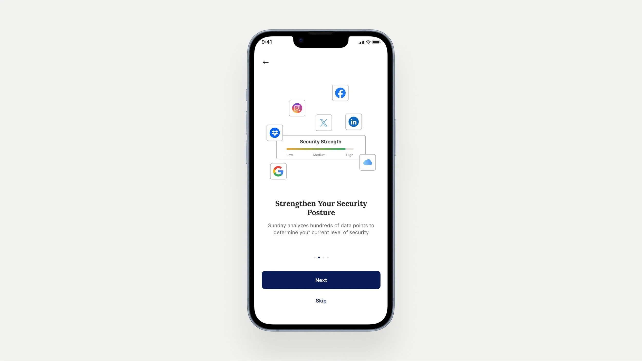
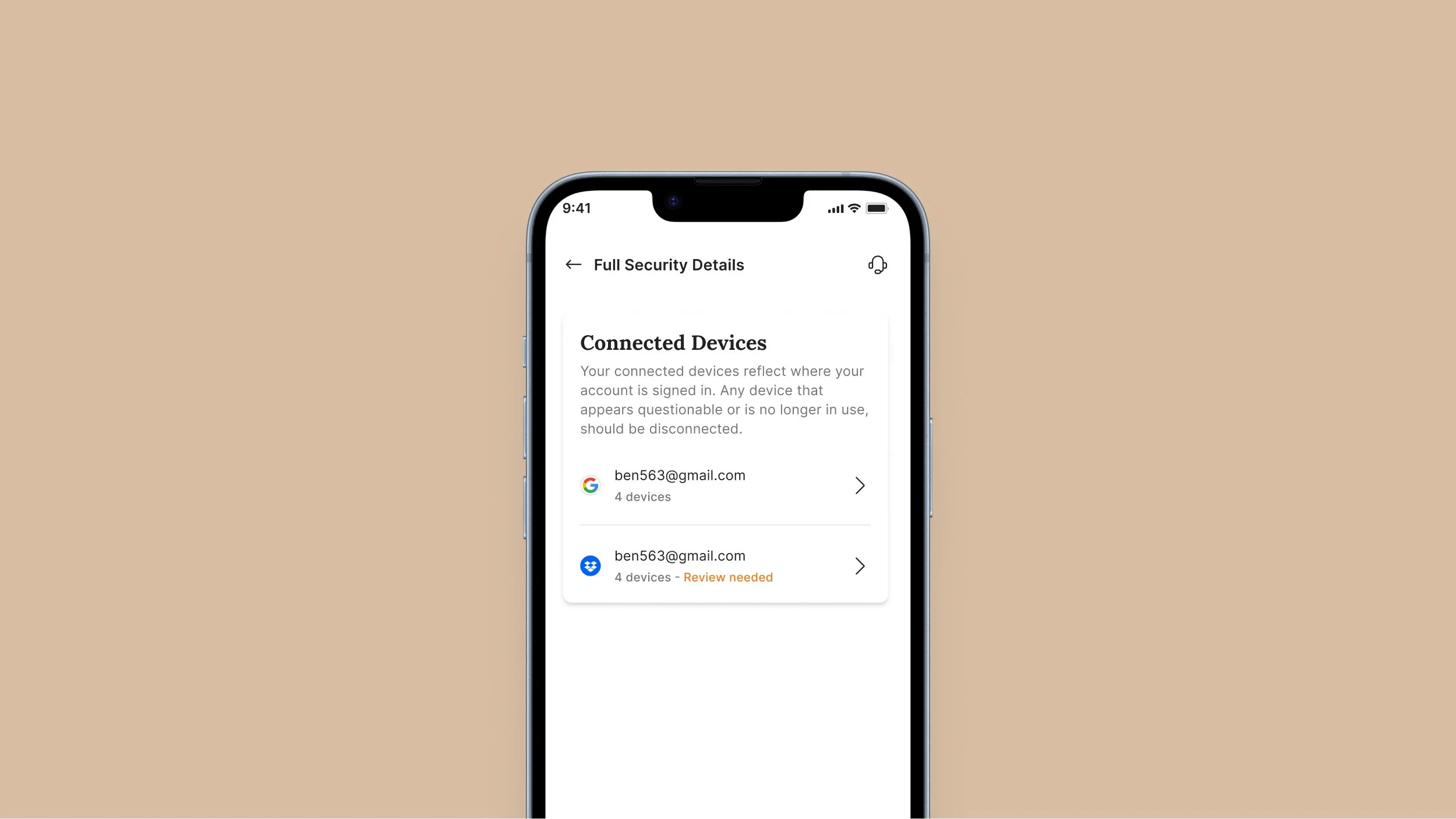
The core issue we faced was a lack of clarity among users regarding how to address security issues in their personal accounts. Initially, the app displayed security settings for each account—such as outdated passwords, breached accounts, or missing two-factor authentication (2FA). While this dashboard provided necessary information, users were often unsure of what actions to take based on these settings. The information alone wasn’t enough; users needed clear guidance on how to address their security concerns effectively.
Initial Assumptions and Challenges
At the outset, we assumed that simply presenting security settings would be sufficient for users to understand and act on necessary improvements. However, it soon became clear that users were overwhelmed by the complexity of the information and lacked direction on how to resolve the identified issues. This challenge highlighted the need for a more user-friendly approach, which would not only present security concerns but also offer actionable steps for resolution.
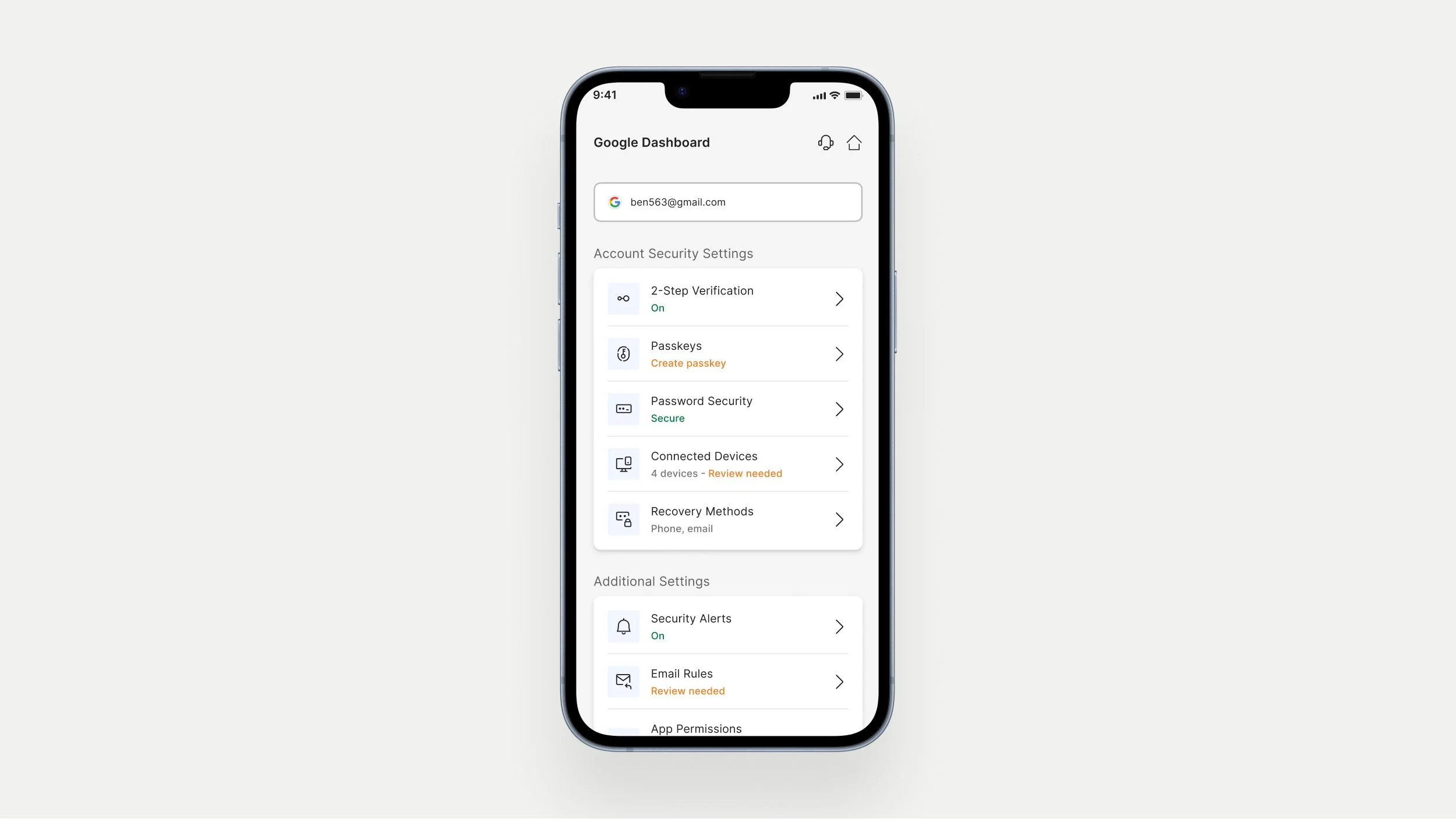
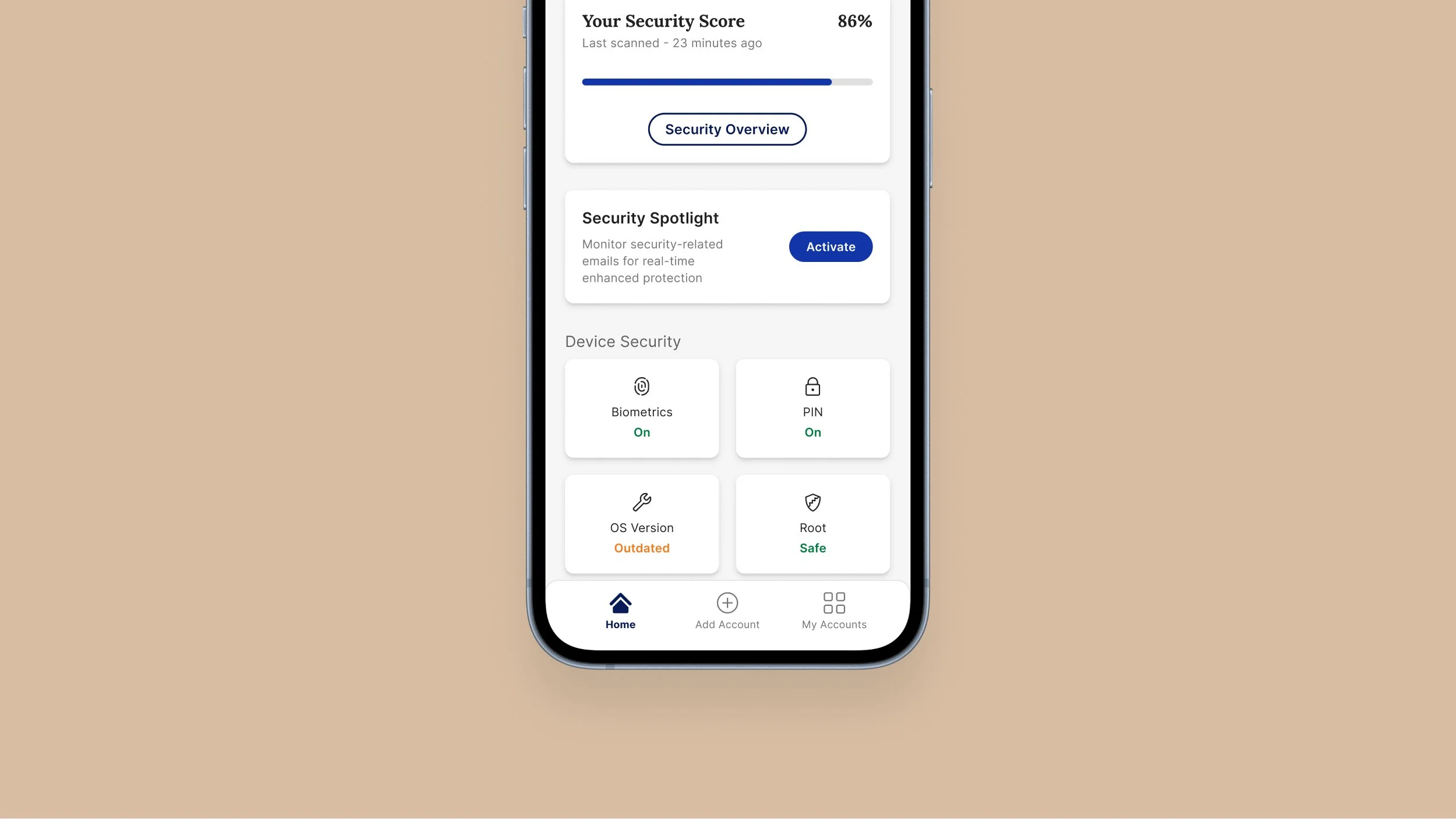
The initial Account Dashboard screenResearch & Discovery
To address the problem of users being unclear on how to act on security issues, we conducted extensive research into common security practices and pain points, focusing on how high-profile individuals manage their online accounts. We interviewed potential users, primarily C-level executives, to uncover how they perceive and handle security concerns. This research revealed three key user needs:
Centralization: Users require a unified platform to manage all their accounts effectively.
Guidance: Users needed clear, actionable instructions to address security issues, rather than just identifying them.
Proactive Support: Users wanted proactive alerts and recommendations to prevent emerging threats.
Design Process
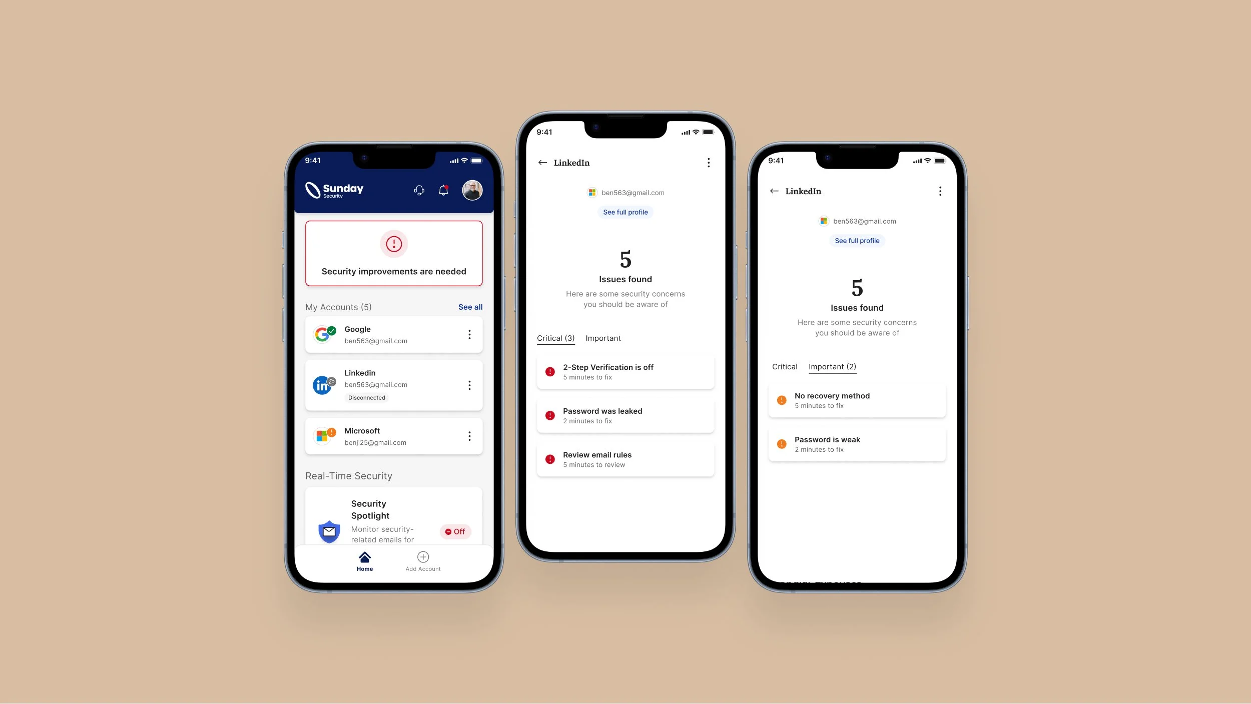
We focused on creating a more intuitive and actionable experience. We developed wireframes and prototypes for a ‘Home Screen’ that prominently featured a Security Health Meter, providing a clear visual representation of overall security status. To guide users through the process, we integrated a step-by-step wizard that breaks down complex security tasks into manageable actions. This included real-time alerts and personalized recommendations to help users resolve vulnerabilities effectively. Additionally, we redesigned the onboarding flow to simplify account connections and used color-coded indicators to help users prioritize necessary actions. The visual design emphasized clarity and ease of use, with strong cues to reassure users about data privacy and encryption.
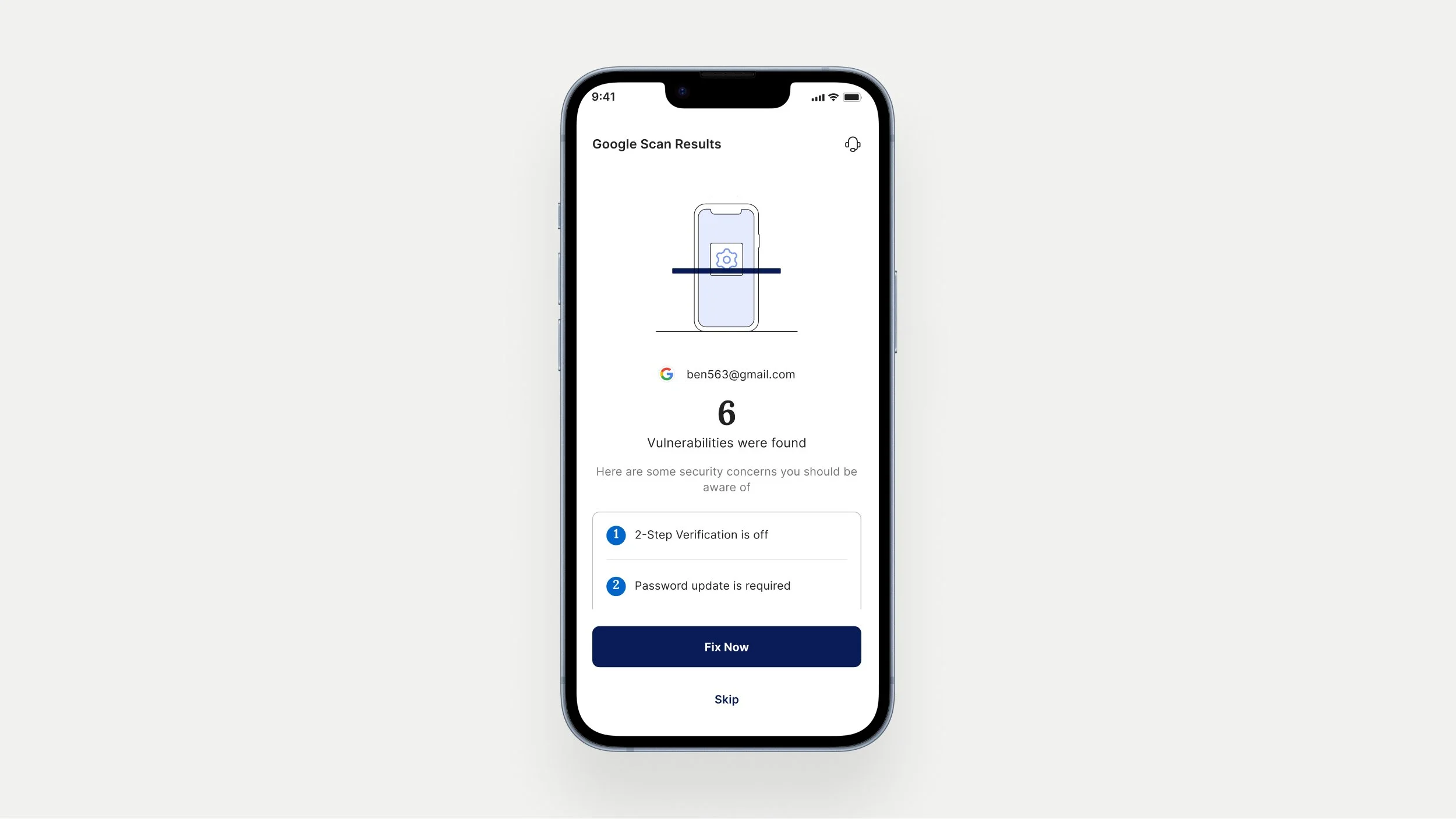
Solution
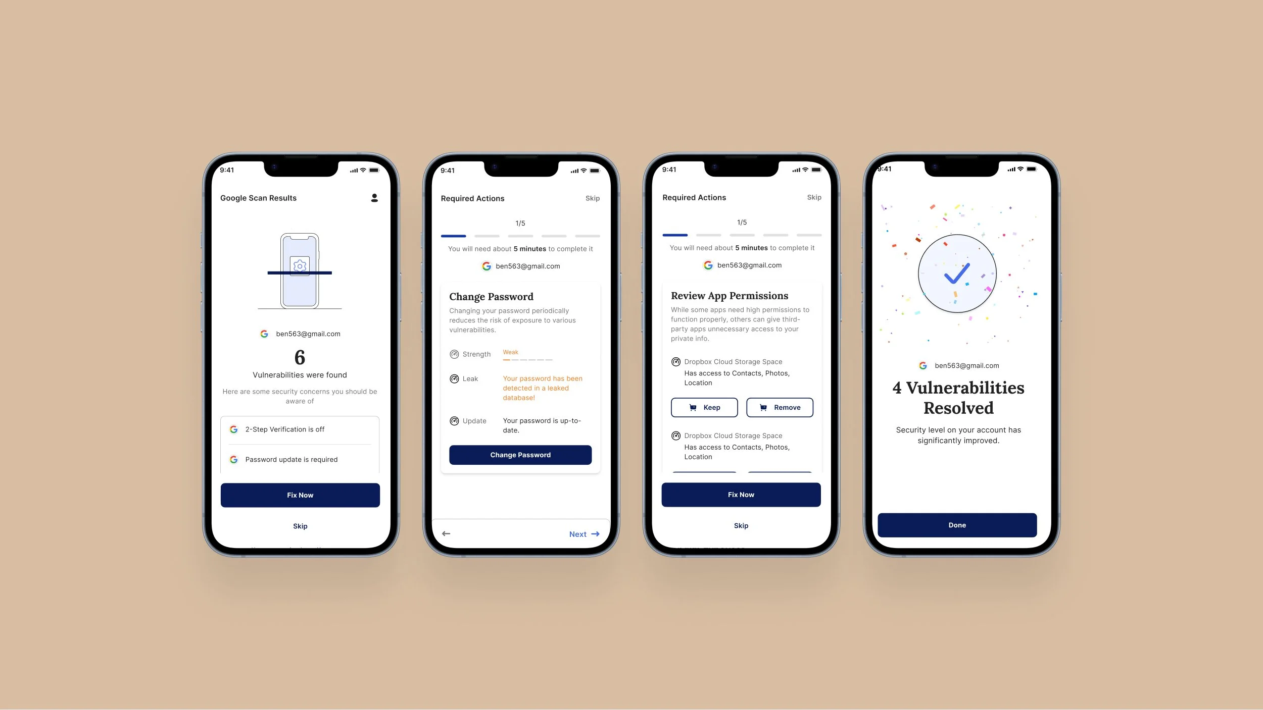
To bridge the gap between identifying security issues and taking corrective actions, we introduced a wizard within the app. This wizard scans user accounts, identifies potential security problems, and provides step-by-step instructions for resolution. It offers users a guided experience, making complex security assessments more manageable by breaking them down into clear, actionable steps. This approach not only simplified the process but also empowered users to address vulnerabilities effectively and proactively.
Implementation
User-Centric Approach: We conducted user research to identify pain points and expectations, utilized Customer Journey Mapping to visualize user interactions, and created User Flows for a seamless experience.
Design System and Information Architecture: We developed a design system to ensure consistency and structured content to enhance user understanding.
Collaboration and Integration: We worked closely with development, marketing, and product teams to align design with functionality and business goals.
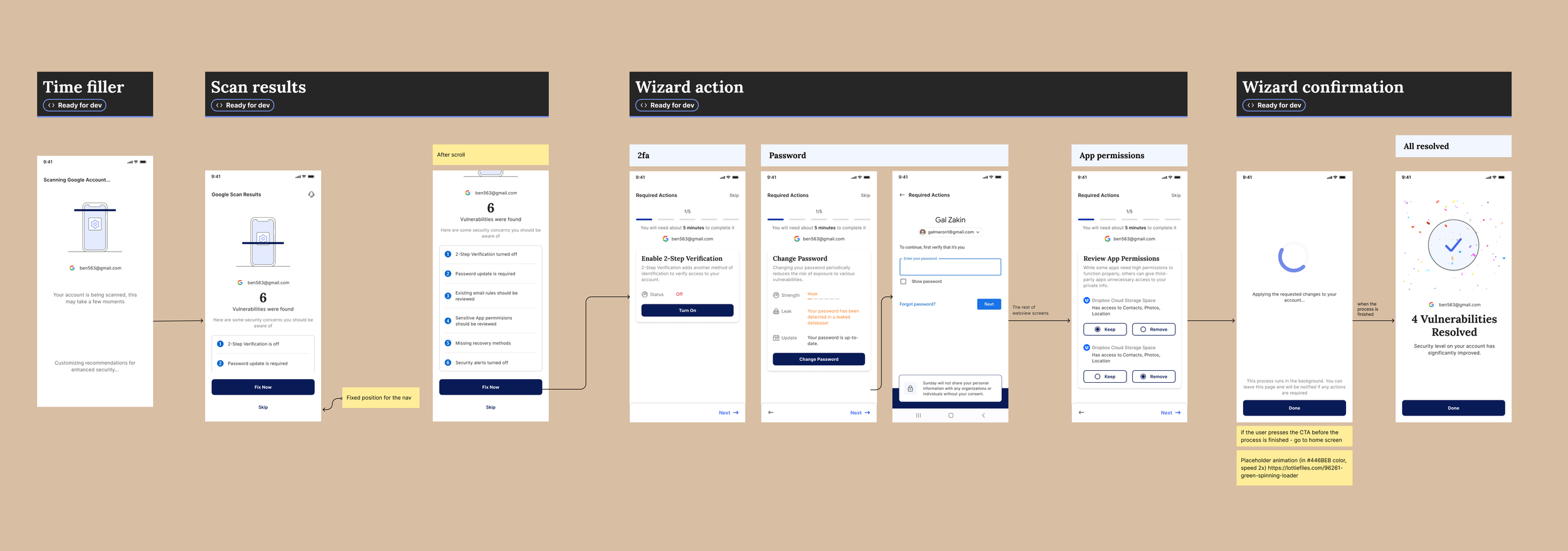
A screenshot of the Wizard flow from our Figma fileResults
The introduction of the wizard led to:
Increased User Engagement: A threefold increase in the number of tasks solved compared to previous periods, with positive user feedback indicating higher satisfaction.
Business Impact: Improved customer acquisition and sales, and a better understanding of user needs, particularly among those not traditionally associated with security.
Enhanced Accessibility: The redesign made security management accessible to a broader audience, beyond just security professionals.
Lessons Learned
The project underscored the importance of not just identifying issues but also guiding users through the resolution process. The wizard’s introduction transformed how users interacted with the app, making security management more intuitive and effective.
Future work
Efforts to simplify the application and improve user experience have been ongoing, with a key focus on making it easier for users to enhance their account security. One major initiative still in progress is the redesign of the home page. The new, more user-friendly home page is being developed to better engage users and encourage them to take proactive steps in safeguarding their accounts.